Earth, Inc. Shareholder Report: Built Capital
| Topics: |
BUILT CAPITAL: Built capital includes traditional infrastructure - housing, roads, electric grids, goods & services traded in markets, and all other elements built by humans, that comprise communities. Built capital is commonly measured in two ways: as a stock (sum total of physical assets), or as a flow of assets produced and consumed over a given time period (typically measured as GDP).
Report on Built Capital Assets
Stocks
 (Source: Authors)
 Built capital is a measure of housing, roads, electricity infrastructure, and all built structures that comprise communities. Built capital is measured in two ways: physical assets, the stock, and Gross Domestic Product (GDP), the flow. Of all the capitals calculated in this report, built capital is most closely aligned with standard measures of economic progress.
Produced Assets
 Nighttime light intensity from satellite imagery of Europe identifies the spatial locations of built capital. (Source: Authors)
 Produced assets, the stock, are estimated by examining the capital investment of countries. Data was acquired from unpublished World Bank estimates.
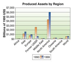 Produced assets by region. (Source: Authors)
 Their means of obtaining the data employed the Perpetual Inventory Method, which derives data from investment information, along with assumptions about asset lives and an initial assumption about the capital stock (based on an assumed initial capital-output ratio) (Kunte et al. 1998). Over the period of time from 1990 to 1999, the world's average produced assets increased only slightly. Most striking is the plummeting of the Former USSR's produced assets. Also notable is the North America region's height above all other regions; compared with North America, Africa barely registers on the same graph.
 Percent change in GDP, 1990-2000. (Source: World Bank)
 Flows
Gross Domestic Product (GDP)
Gross domestic product (GDP) is a measure of the annual market value of all goods, services, and structures produced in an economy. GDP is the standard economic means of measuring progress. In the graph below, GDP has been calculated per capita by region, using data acquired from the World Bank. In 2000, world per capita GDP was $6,594. For that same year, per capita GDP was $1,038 for Africa and $19,448 for North America, highlighting global economic disparity. Many of the same trends witnessed in the produced assets graph can be witnessed in the GDP graph – the world average increased only slightly; the Former USSR lost ground over the decade; and North America swept upward, paralleled by Europe.
Case Study: Indonesia
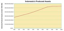 Indonesia's produced assets. (Source: Authors)
 Indonesia, an archipelago in southeast Asia, provides an interesting case study in the insights built capital can provide. Graphs of Indonesia's produced assets and Indonesia's GDP show a striking similarity. In 1997, there is a notable change in the slope of the line. In the case of produced assets, the line flattens out as it approaches the year 2000. In the case of GDP, there is a dramatic drop between 1997 and 1998, followed by a modest rise in the ensuing years. Something striking happened to Indonesia's economic development during this time.
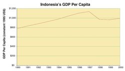 Indonesia's GDP per capita. (Source: Authors)
 In July of 1997, the Far Eastern Economic Review published an article stating that as much as 30% of World Bank funds disbursed to Indonesia had been diverted for corrupt uses. Suharto, who had served as president of Indonesia since the 1960's, was widely regarded as the corrupt culprit. Over the years, he had placed family members in strategic leadership positions, and his family held sway over much of Indonesia's economic life. In October of 1997, the country's currency began to fall. On its heels, the stock market plummeted. The International Monetary Fund (IMF) agreed to provide Indonesia with a $40 billion aid package in exchange for economic reforms, but Suharto was reluctant to implement reforms. Indonesia's currency continued to plummet, from a high of 2,880 rupiah to the dollar before the crisis to a low of 17,000 rupiah to the dollar as the crisis reached a fever pitch.
In May of 1998, amidst student protests and riots over rising prices, Suharto stepped down. The freefall witnessed in the GDP graph ended, and Indonesia began to make modest gains in GDP, though by 2000, it was only back to 1994 levels.
Indonesia's physical assets stagnated between 1998 and 2000. The road to regaining international trust and achieving an economic recovery is long. The example of Indonesia shows a clear link between built capital and the economic and political stability of the country. Under apparently unstable political or economic regimes, investment typically slows or stops completely. Though Suharto's corruption began long before 1997, it wasn't until this corruption was exposed that economic repercussions were felt.
What does this indicate about our standard definition of progress? Despite a quality of life that suffered under corrupt rule, all economic indicators pointed towards progress. In this case, "progress" meant an increased concentration of wealth among corrupt officials. The standard economic measures are not enough to measure well-being or quality of life. It's time to expand our understanding.
How important is built capital and GDP to welfare? Correlations were done with the UN Human Development index and the Prescott-Allen Human Welfare index.
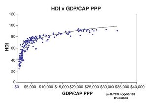 HDI versus GDP per capita. (Source: Authors)
 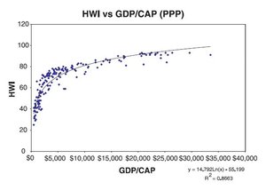 HWI versus GDP per capita. (Source: Authors)
 Additionally Inglehart and others examined the relationship between subjective measures of happiness and life satisfaction from the World Values survey. Whether using objective or subjective measurements, these graphs all show a very strong relationship between rising income and human welfare up to about $10,000 per capita GDP.
Above the $10,000 level the contribution of GDP to welfare declines. Inglehart characterizes the primacy of economic gains at the lower income levels and "lifestyle" at the higher level. Our assessment is that at least three factors are at work. First the contributions of human, social, and natural capital are left out of GDP. Second, once material needs have been met, other factors become more important. Third is the possibility of "uneconomic growth". "Uneconomic growth" occurs when the costs of growth exceed the benefits. The accumulation of material possessions invariably leads to pollution, sprawl, and resource depletion. At a certain point these costs outweigh the benefits and further growth is detrimental to welfare.
Built Capital Liabilities
CO2 and Climate Related Economic Losses
Introduction
The fossil fuel consumption needed to produce built capital, energy, and transportation services results in emissions including CO2. As a byproduct of economic production, CO2 impacts natural capital in the form of climatic instability, and can be considered as a liability of built capital, at least when fossil fuels are burned to create it. One approach to estimate the liability created by anthropogenic (human-produced) carbon dioxide emissions, is to look at the global scale of economic losses due to weather related storm (Tropical weather and hurricanes) catastrophes in the decade of the 1990's.
Stocks
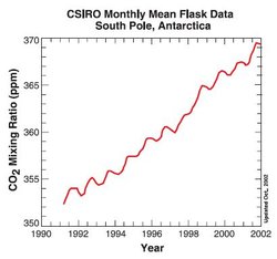 CSIRO monthly mean flask data, South Pole, Antarctica. (Source: Authors)
 During the decade in question, the atmospheric (Atmospheric composition and structure) carbon dioxide level (stock) in parts per million, increased from 353 ppm to 369 ppm, which was a 4.5% increase for the decade or 0.45% annually on average.
 Trends in atmospheric concentrations and athropogenic emissions of carbon dioxide. (Source: Oak Ridge National Laboratory, 2001)
 The historical data shows that CO2 concentration has basically held in the range of 280 ppm, from the years 1000-1800 A.D. The concentration then increased on a standard J curve, coinciding with the advent of significant coal emissions and then the combustion of other fossil fuels. This anthropogenic contribution has roughly increased the percentage of all atmospheric carbon loading by 66% in the last two centuries. Because fossil fuel combustion has been proven as the majority green house gas contributor, it is typically chosen as an indicator for anthropogenic contribution.
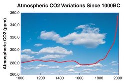 Atmospheric CO2 variations since 1000BC. (Source: Authors)
 Another human-caused factor is that land use change, including deforestation and wetland destruction, has radically affected the planet's natural ability to absorb CO2. The overall trend has been a loss of the ability to cycle and absorb CO2 of 1700 tg (trillion grams) C between the years 1900 and 1990. Hence, this CO2 has been added to the atmosphere (Atmospheric composition and structure) and contributed to the greenhouse effect. The 1990's, however, have shown a significant drop in CO2 flow into the atmosphere due to land use change. This appears on the graph to be due to the contributions of Latin America, tropical Asia, and China.
 Annual net flux of carbon to the atmosphere from land-use change: 1850-2000. (Source: Houghton and Hackler)
 Although there are many opinions about the effects of climate change, the correlation between CO2 and global temperature has been well documented. (see Graph on temperature and CO2) The Goddard Institute at NASA has determined that for every doubling of CO2 concentration, we will be forcing up the temperature on the planet by 3 degrees F. At the current 0.45% yearly increase, by 2050 we will have a 24% increase in CO2, to a level of 456 ppm CO2. This corresponds to an accompanying .7 degree average temperature increase. The predictions for rise in sea level by 2100 vary from 2-5 feet.
 Temperature and CO2 concentration in the atmosphere over the last 400000 years (from the Vostok ice core). (Source: )
 This could have dire consequences for entire nations; the low lying areas of Bangladesh are in jeopardy of being flooded, which alone would dislocate millions of people and represent a loss of many billions of dollars. The United States stands to suffer as well. Simply in terms of the luxury real estate market, tremendous loss could be incurred via loss of coastline. Projections for Massachusetts may serve as a good predictor for other coastal states:
…"A team at the Woods Hole Oceanographic Institute has calculated Massachusetts' loss of land to the rising sea as warming progresses. Using the rather modest U.S. Environmental Protection Agency projections of sea level rise by 2025, they calculated that Massachusetts would lose from 7,500 to 10,000 acres (3,035 to 4,047 hectares) of land. Based on just the lower estimate and a nominal land value of $1 million per acre for ocean-front property, this would amount to a loss of at least $7.5 billion of particularly expensive property by then. Some of the 72 coastal communities included in the study would lose far more land than others. Nantucket could lose over 6 acres and Falmouth 3.8 acres a year." (Copyright © 2001 Earth Policy Institute Lester R. Brown November 15, 2001)
"2000 was the fifth hottest year ever recorded for global surface [[temperature]s], following 1998, 1997, 1995, and 1990. Every year of the 1990s was among the planet's hottest 15 since records began in 1880, making it the hottest decade on record" (Climate of 1999 - Annual Review, National Climatic Data Center, National Oceanic and Atmospheric Administration, 12 Jan. 2000.)
Flows
Fossil Fuel Emissions by Country
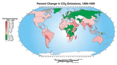
 Percent change in CO2 emissions by world region 1990-1999. (Source: Authors)
 The main driver of the C02 atmospheric loading is clearly the combustion of fossil fuels. The overall trends for emissions by region can be seen in the graph below.
Overall, the percentage change for each of the regions is as follows:
- Europe: 17.5%
- Former Soviet Union: 38% decrease (though as no data is reported for several regions of the Former Soviet Union in the early 1990's, a 25% decrease is probably more likely. Using the 1992- 1999 figures, there is a 28 percent reduction)
- Middle East: 77%
- North America: 14%
- Oceania: 29%
- Asia: 28%
- South America: 32%
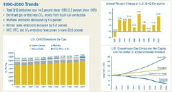 Trends in greenhouse gas emissions, 1990-2000. (Source: Authors)
 One interesting country, in terms of tracing fossil related emissions: (Note, units in gigatons): The United states: 17% increase from 4,834,340 to 5,648,240 g tons.
Clearly, the United States is driving the North American C02 contribution and this has steadily increased through the decade.
 Percent change in CO2 emissions 1990-1999. (Source: Authors)
 Economic Loss Due to climate change
 Natural disaster trends. (Source: )
 Economic losses from severe weather can provide some measure of the current liability of CO2 emissions. There is no doubt that each region is contributing to global climate change. But what does this mean in terms of economic loss? The trends for global economic loss as related to storm (Tropical weather and hurricanes) events show an 180% increase in total economic losses for the 1990's as compared to the 1980's. This represents an increase of 280 billion dollars, from 153 billion to 433 billion dollars. Insured losses showed an increase from 25 billion in the 1980's to 90 billion in he 1990's. The economic losses reported are adjusted for 2002 dollars, and there seems to be a great deal of discrepancy with these figures to what was reported previously by international sources such as the Insurance group Munich RE. It is very difficult to get accurate loss figures from the global reinsurance companies as these figures are proprietary. Needless to say the insurance industry is concerned about climate change.
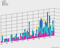
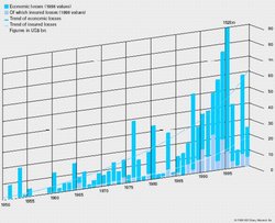 Economic losses from natural disasters. (Source: )
 As can be gleaned from the graphs, the major increased areas of economic loss have to do with an escalating trend in wind and water related storms, rather than volcano and earthquake related storms. This is consistent with IPCC (International Panel for Climate Change) and others' predictions forecasting the violent effects of a warming environment.
 Worldwide insured losses due to great weather disasters, by decade. (Source: Munich Re)
 There is no doubt that part of the increase in economic damage from severe weather is due to the increase in built capital over time such as housing, particularly in vulnerable coastal areas. Likewise, some of the increase in insured losses is due to the greater amount of insured property. Determining the amounts due to climate change and the amounts due to increased built capital and insurance was beyond the scope of this report.
However, independent of the increase in property or insurance, the frequency of severe weather has been increasing over the last several decades.
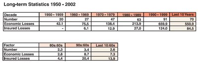 Long-term statistics, 1950-2002. (Source: Authors)
 Definition of great natural catastrophes
Natural catastrophes are classed as great if the ability of the region to help itself is distinctly overtaxed, making interregional or international assistance necessary. This is usually the case when thousands of people are killed, hundreds of thousands are made homeless, or when a country suffers substantial economic losses, depending on the economic circumstances generally prevailing in that country.
Conclusion
The liability of CO2 as a byproduct of fossil fuel emissions and built capital is demonstrated by the increase in severe weather and higher [[temperature]s]. The data shows evidence of a two fold increase in economic losses in the 1990's over the1980's, which are directly attributable to increased storms of both wind and water related nature. Not addressed in this investigation is concern about the possible shift in ocean current "conveyor belts" that have historically warmed Europe. Further, there are other aspects of global warming which may instigate other dynamics not well understood, such as the sudden unloading of methane hydrate in the ocean. This could conceivably release massive amounts of methane into our atmosphere (Atmospheric composition and structure), a greenhouse gas even more potent than CO2.
Further Reading
Climate of 1999 - Annual Review, National Climatic Data Center, National Oceanic and Atmospheric Administration, 12 Jan. 2000.
| This is a chapter from Earth, Inc. Shareholder Report (e-book). Previous: Natural Capital|Table of Contents|Next: Human Capital |