Supply and demand
| Topics: |

By Wdflake at en.wikipedia Domain, from Wikimedia Commons
Contents
Theory of Supply
We will start with the following thought experiment. Suppose there is a condominium apartment building where all the apartments are identical, and each apartment has a different owner. Suppose that a number of them might be interested in selling their apartments. For the purposes of this thought experiment, we will assume that they are all well-informed and interested primarily in their potential monetary gain.
Each owner has a slightly different idea of what would be an acceptable price. No owner will accept less than $91,000 for his or her apartment. At a price of $91,000, one owner is willing to sell. At a price of $92,000, two owners are willing to sell. In fact, it turns out that each time the price rose by $1,000 there is one more owner willing to sell an apartment. None would be willing to sell at $90,000.
The Supply Schedule and Curve
|
| |||||||||||
| Price ($1000s) | 100 | 99 | 98 | 97 | 96 | 95 | 94 | 93 | 92 | 91 | 90 |
| Quantity of Apartments Supplied | 10 | 9 | 8 | 7 | 6 | 5 | 4 | 3 | 2 | 1 | 0 |
The result of this pattern is the schedule that is shown in Table 1, which we call a supply schedule. A supply schedule shows us, in the form of a table, the quantity of a good or service that would be offered by the sellers at each possible price.
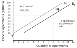
From the supply schedule, we can graph a supply curve, as shown in Figure 1, which shows the same information in a different form. If we ask how many apartments will be offered for sale at a price of $96,000, for example, we can look across from $96,000 on the vertical (price) axis over to the supply curve, and then drop down to the horizontal (quantity) axis to find that the answer is 6.

Note that the supply curve in Figure 1 slopes upward. This seems reasonable, consistent with an expectation that suppliers of a good or service will tend to offer more for sale, the higher the price they receive. Price and quantity have a positive (or direct) relationship along the supply curve.
We see movement along a supply curve when we note, for example, that the quantity of apartments that will be offered for sale rises from 6 to 7 as the price rises from $96,000 to $97,000. This is a case of change in quantity supplied. It is important to refer to movement along a supply curve as change in the quantity supplied in order to avoid confusion with the topic of the next section.
Check yourself by answering this question with reference to Table 1 or Figure 1: By how much does the quantity supplied change when the price changes from $97,000 to $100,000?
Changes in Supply
In contrast to changes in quantity supplied, we say there has been a change in supply when the whole supply curve shifts.
Why might the whole curve shift? Models make frequent use of ceteris paribus (“all else constant”) assumptions. The supply curve shown in Figure 1 holds, we presume, for a given set of circumstances. But what if circumstances were different? What if there were more sellers at each price? Or what if the same sellers were generally willing to accept lower offers?
Suppose that at each price there were two more potential sellers. The supply curve would shift to the right from S1 to S2 as illustrated in Figure 2. Now, at a price of $96,000, for example, 8 owners are willing to sell, instead of only 6. We can describe this increase in supply by saying either that “supply has risen” or that “the supply curve has shifted out.” (It may seem confusing that a supply increase shifts the supply curve down. Remember to start the “story” by reading across horizontally from the price axis. Then you will notice that the shift goes out toward higher numbers on the quantity axis.)
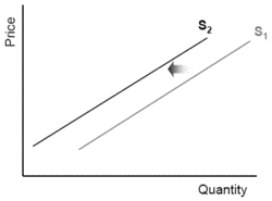
We would see the same result if, instead of new sellers entering the market, the existing sellers each became willing to accept $2,000 less. (This might happen, for instance, because increasing flood danger or crime in the area makes them more eager to sell.) In this case as well, 8 owners would now be willing to sell at a price of $96,000, whereas before it took a price of $98,000 to get 8 owners to want to sell. This would also be termed an “increase in supply” and again the supply curve would shift as illustrated in Figure 2.
If instead, the number of sellers goes down, or the minimum price each seller is willing to accept rises, the supply curve will lie to the left of the original one, as shown in Figure 3. We say that “supply has decreased,” or “supply has fallen,” or “the supply curve has shifted back.”
Thus the number of sellers and their preferences are among the things that can affect the location of the supply curve. Many other factors affect the location of the supply curve. What exactly these non-price determinants of supply are will generally depend on what, specifically, is being sold in a market. While we’ve rather arbitrarily chosen a simple real estate market for our example, the determinants of supply will vary depending on whether the item in question is an asset, produced good, or service, and on particular characteristics of the item. For example, in the market for oil, the determinants of supply will include the success of oil exploration and discovery (a big new discovery will increase supply), while in the market for computers, technological innovations that lower chip costs will increase supply. In the market for corn, a bad harvest would reduce supply, but new, more productive varieties of corn would increase it. You can easily think of similar examples for other goods and services.
Theory of Demand
Now let us assume that there a number of potential buyers of apartments, and that they are also well informed and interested in purchasing an apartment, to live in or rent out, if they can get one at a good price. However, they have a different point of view. They all regard a price of $100,000 as too high: none of them will purchase an apartment at that price. However, one of them is willing to pay much as $99,000; that individual and another potential buyer are both willing to buy if the price drops to $98,000; and so on.
The Demand Schedule and Curve
|
| |||||||||||
| Price ($1000s) | 100 | 99 | 98 | 97 | 96 | 95 | 94 | 93 | 92 | 91 | 90 |
| Quantity of Apartments Supplied | 0 | 1 | 2 | 3 | 4 | 5 | 6 | 7 | 8 | 9 | 10 |
In Table 2, we show the demand schedule that reflects this case. A demand schedule describes, in the form of a table, the quantity of a good or service that buyers are willing to purchase at each possible price.
From the demand schedule we can graph a demand curve, as shown in Figure 4. Note that the demand curve in Figure 4 slopes downward. It seems reasonable to expect that, generally, the higher the price of a good, the fewer people will want to buy. Price and quantity have a negative (or inverse) relationship along the demand curve.
 Figure 4: The Demand Curve for Apartments. The demand curve shows the same information as the demand schedule. At higher prices, fewer apartments are desired by people looking to buy. (Source: GDAE)
 A movement along a demand curve—for example, if we note that the quantity of apartments that will be purchased falls from 4 to 3 as the price rises from $96,000 to $97,000—must always be referred to as a change in the quantity demanded.
Check yourself by answering this question with reference to Table 2 or Figure 4: By how much does the quantity demanded change when the price changes from $97,000 to $100,000?
Changes in Demand
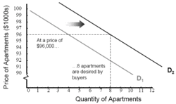 Figure 5: An Increase in Demand The demand curve shifts outward (to the right) when more buyers want to buy at a given price, or buyers are willing to pay a higher price for a given quantity. (Source: GDAE)
 As with supply, we distinguish between a change in quantity demanded and a change in demand. When there is a change in demand, the whole curve shifts.
Why might the whole curve shift? Suppose there is a large movement of population into the area around our hypothetical apartment building. Many more people need housing. Or suppose that a number of the potential buyers experience an increase in income or inherit money from relatives, becoming able (and willing) to pay more than they formerly could afford. Specifically, suppose that at every price there are now 4 more willing buyers for apartments in this building. Such a change is illustrated by the shift to the right from D1 to D2 in Figure 5. We say that “demand has risen” or “the demand curve has shifted out.” (Because of the curve’s negative slope, in this case shifting “out” also means shifting “up.”)
We would see the same result if, instead of new buyers entering the market, the existing buyers each became willing to pay $4,000 more for an apartment. This could be because prices for similar apartments in other buildings in this city have risen. Other, similar apartments are what economists call substitutes. That is, they are items that can be used in place of other items.
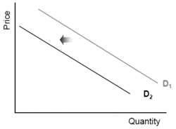 Figure 6: A Decrease in Demand. When the demand curve shifts inward (to the left), we say that demand has decreased. (Source: GDAE)
 A classic example of substitute goods is Coke versus Pepsi. An increase in the price of a substitute good tends to increase the demand for the good in question (because people who are unwilling to pay the higher price will shift to the substitute good whose price has not risen). A rise in the price of comparable apartments could lead to an “increase in demand” for apartments in this building. This would also be illustrated by Figure 5.
On the other hand, other things might be complements to these apartments. Complements are goods that are used along with the good in question. A classic example of complementary goods is hot dogs and mustard. Suppose, for example, the apartments are far from the locations in which people work. A rise in the price of gasoline would make these apartments less attractive. Demand for the good in question tends to decrease with an increase in the price of a complementary good. This is shown in Figure 6.
Thus the number of potential buyers, their ability to pay, and things like prices of substitutes and complements are among the things that can affect the location of the demand curve. Many other factors affect the location of the demand curves, depending on the specific market in question. For example, in the market for steel, overall economic growth will increase the demand for steel, while the development of substitute materials, such as plastic composites for use in automobiles, will decrease it. Hotter weather will increase demand for ice cream, but will decrease the demand for sweaters – and so forth. We can easily identify many examples of other demand shifts in everyday life.
Further Reading
- Global Development And Environment Institute, Tufts University
| Disclaimer: This article is taken wholly from, or contains information that was originally published by, the Global Development And Environment Institute. Topic editors and authors for the Encyclopedia of Earth may have edited its content or added new information. The use of information from the Global Development And Environment Institute should not be construed as support for or endorsement by that organization for any new information added by EoE personnel, or for any editing of the original content. |