PowerPoint 2010
Working with Charts
Charts
In many ways, charts are an ideal way to present information in PowerPoint 2010. They give you an illustration of your data. A chart can help you show your audience what your data means and why it's important. Plus, they can add visual interest to slide shows that are otherwise filled with text. To use charts effectively, you'll need to know how to insert and modify them.
Types of charts
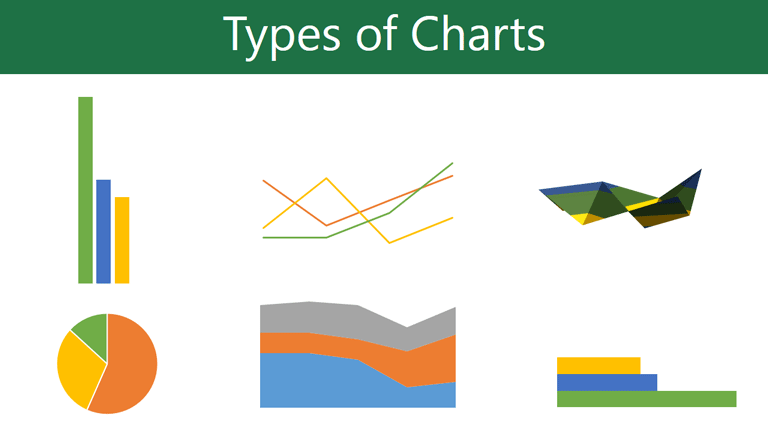
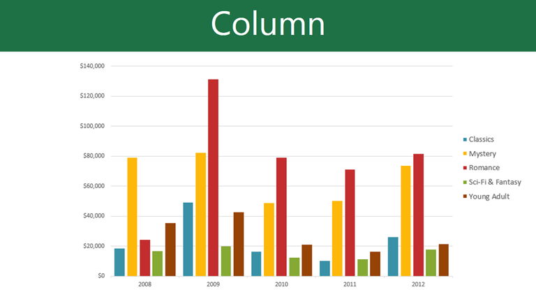
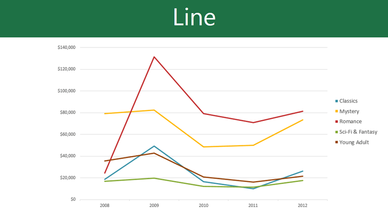
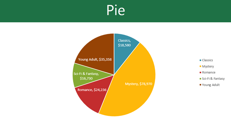
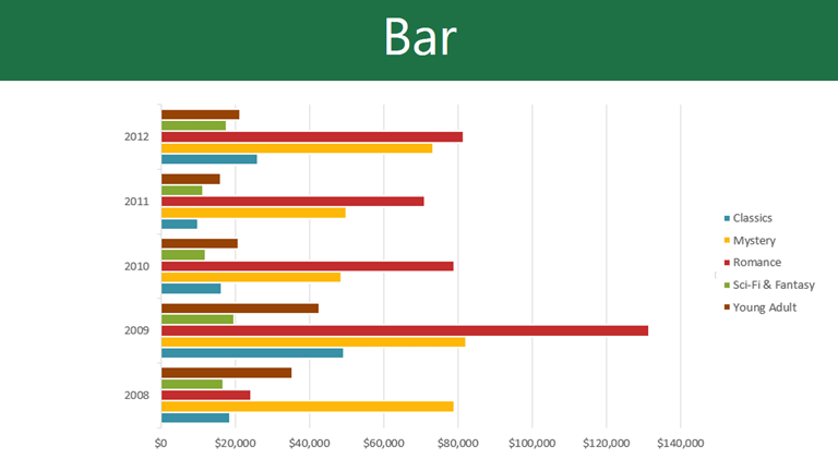
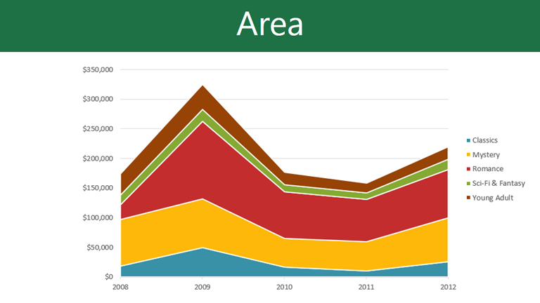
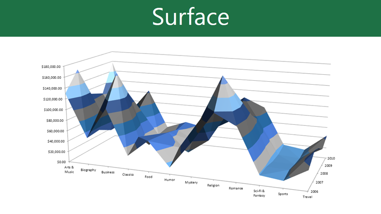
Click the arrows in the slideshow below to view examples of some of the types of charts that are available in PowerPoint.
Identifying the parts of a chart
Click the buttons in the interactive below to learn about the different parts of a chart.
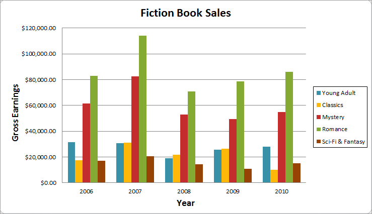
Horizontal Axis
The horizontal axis (also known as the x axis) is the horizontal part of the chart.
In this example, the horizontal axis identifies the categories in the chart, so it is also called the category axis. However, in a bar chart, the vertical axis would be the category axis.
Legend
The legend identifies which data series each color on the chart represents. For many charts it is crucial, but for some charts it may not be necessary and can be deleted.
In this example, the legend allows the viewer to identify the different book genres in the chart.
Data Series
The data series consists of the related data points in a chart. If there are multiple data series in the chart, each one will have a different color or style. Pie charts can only have one data series.
In this example, the green columns represent the Romance data series.
Title
The title should clearly describe what the chart is illustrating.
Vertical Axis
The vertical axis (also known as the y axis) is the vertical part of the chart.
In this example (a column chart), the vertical axis measures the height, or value of the columns, so it is also called the value axis. However, in a bar chart, the horizontal axis would be the value axis.


