Excel 2010
Working with Sparklines
Creating sparklines
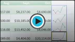
Sparklines were introduced in Excel 2010 to be a convenient alternative to charts. Unlike a traditional chart, a sparkline is placed inside a cell, allowing you to easily create a large number of sparklines (for example, one on each row).
Types of sparklines
There are three different types of sparklines: Line, Column, and Win/Loss. Line and Column work the same as line and column charts. Win/Loss is similar to Column, except it only shows whether each value is positive or negative, instead of how high or low the values are. All three types can display markers at important points, such as the highest and lowest points, to make them easier to read.
 Line
Line Column
 Win/Loss
Why use sparklines?
Sparklines are basically charts, so why would you want to use sparklines instead of charts? Sparklines have certain advantages that make them more convenient in many cases. Imagine you have 1000 rows of data. If you place a sparkline on each row, it will be right next to its source data, making it easy to see the relationships between the numbers and the sparkline. If you used a traditional chart, it would need to have 1000 data series in order to represent all of the rows, and you would probably need to do a lot of scrolling to find the relevant data in the worksheet.
Sparklines are ideal for situations where you just want to make the data clearer and more eye catching, and where you don't need all of the features of a full chart. On the other hand, charts are ideal for situations where you want to represent the data in greater detail, and they are often better for comparing different data series.


