Excel 2010
Working with Charts
Charts
Excel workbooks can contain a lot of data, and that data can often be difficult to interpret. For example, where are the highest and lowest values? Are the numbers increasing or decreasing?
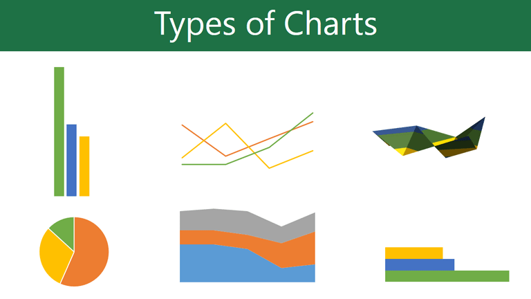
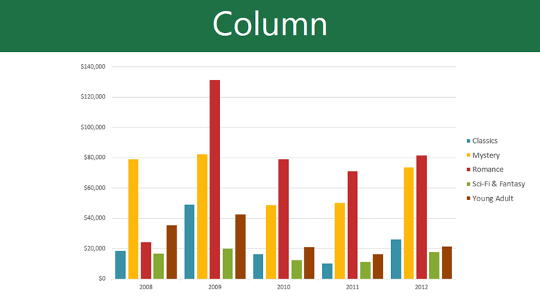
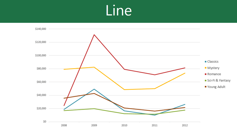
The answers to questions like these can become much clearer when the data is represented as a chart. Excel has many different types of charts, so you can choose one that most effectively represents the data.
Types of charts
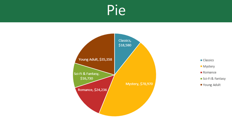
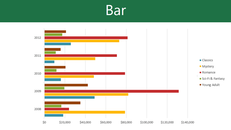
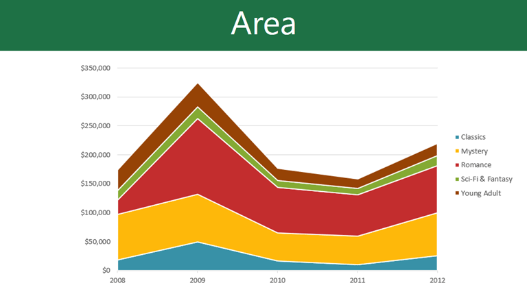
Click the arrows in the slideshow below to view examples of some of the types of charts available in Excel.
Identifying the parts of a chart
Click the buttons in the interactive below to learn about the different parts of a chart.
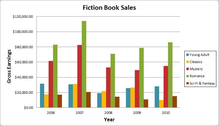
Horizontal Axis
The horizontal axis (also known as the x axis) is the horizontal part of the chart.
In this example, the horizontal axis identifies the categories in the chart, so it is also called the category axis. However, in a bar chart, the vertical axis would be the category axis.
Legend
The legend identifies which data series each color on the chart represents. For many charts it is crucial, but for some charts it may not be necessary and can be deleted.
In this example, the legend allows the viewer to identify the different book genres in the chart.
Data Series
The data series consists of the related data points in a chart. If there are multiple data series in the chart, each one will have a different color or style. Pie charts can only have one data series.
In this example, the green columns represent the Romance data series.
Title
The title should clearly describe what the chart is illustrating.
Vertical Axis
The vertical axis (also known as the y axis) is the vertical part of the chart.
In this example (a column chart), the vertical axis measures the height, or value of the columns, so it is also called the value axis. However, in a bar chart, the horizontal axis would be the value axis.


