

Excel 2010
Working with Charts
Introduction
A chart is a tool you can use in Excel to communicate your data graphically. Charts allow your audience to see the meaning behind the numbers, and they make showing comparisons and trends a lot easier. In this lesson, you will learn how to insert charts and modify them so they communicate information effectively.
Charts
Video: Working with Charts in Excel 2010
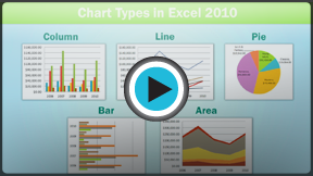 Watch the video (4:31).
Excel workbooks can contain a lot of data, and that data can often be difficult to interpret. For example, where are the highest and lowest values? Are the numbers increasing or decreasing?
The answers to questions like these can become much clearer when the data is represented as a chart. Excel has many different types of charts, so you can choose one that most effectively represents the data.
Types of charts
Click the arrows in the slideshow below to view examples of some of the types of charts available in Excel.
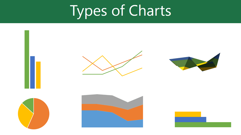
Excel has a variety of chart types, each with its own advantages. Click the arrows to see some of the different types of charts available in Excel.
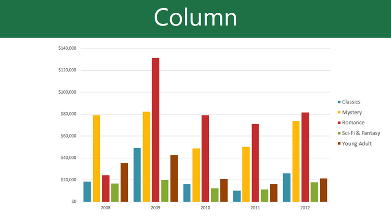
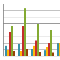
Column charts use vertical bars to represent data. They can work with many different types of data, but they're most frequently used for comparing information.
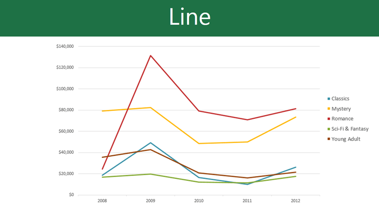
Line charts are ideal for showing trends. The data points are connected with lines, making it easy to see whether values are increasing or decreasing over time.
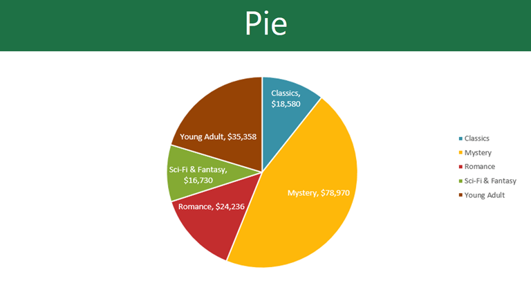
Pie charts make it easy to compare proportions. Each value is shown as a slice of the pie, so it's easy to see which values make up the percentage of a whole.
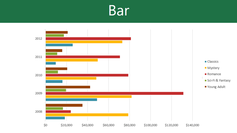
Bar charts work just like Column charts, but they use horizontal bars instead of vertical bars.
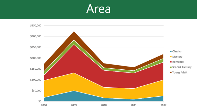
Area charts are similar to line charts, except the areas under the lines are filled in.

Surface charts allow you to display data across a 3D landscape. They work best with large data sets, allowing you to see a variety of information at the same time.

Identifying the parts of a chart
Click the buttons in the interactive below to learn about the different parts of a chart.
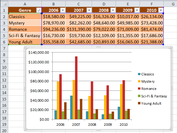
Horizontal Axis
The horizontal axis (also known as the x axis) is the horizontal part of the chart.
In this example, the horizontal axis identifies the categories in the chart, so it is also called the category axis. However, in a bar chart, the vertical axis would be the category axis.
Legend
The legend identifies which data series each color on the chart represents. For many charts it is crucial, but for some charts it may not be necessary and can be deleted.
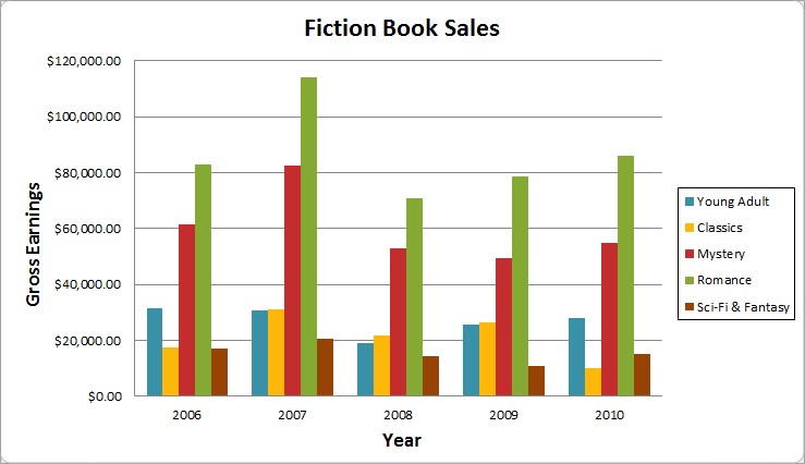
In this example, the legend allows the viewer to identify the different book genres in the chart.
Data Series
The data series consists of the related data points in a chart. If there are multiple data series in the chart, each one will have a different color or style. Pie charts can only have one data series.
In this example, the green columns represent the Romance data series.
Title
The title should clearly describe what the chart is illustrating.
Vertical Axis
The vertical axis (also known as the y axis) is the vertical part of the chart.
In this example (a column chart), the vertical axis measures the height, or value of the columns, so it is also called the value axis. However, in a bar chart, the horizontal axis would be the value axis.
To create a chart:
- Select the cells you want to chart, including the column titles and row labels. These cells will be the source data for the chart.
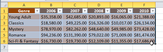 Selecting cells
 - Click the Insert tab.
- In the Charts group, select the desired chart category (Column, for example).
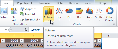 Selecting the Column category
 - Select the desired chart type from the drop-down menu (Clustered Column, for example).
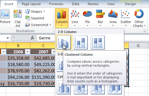 Selecting a chart type
 - The chart will appear in the worksheet.
 The new chart
Chart tools
Once you insert a chart, a set of Chart Tools arranged into three tabs will appear on the Ribbon. These are only visible when the chart is selected. You can use these three tabs to modify your chart.
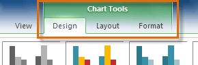 The Design, Layout and Format tabs
To change the chart type:
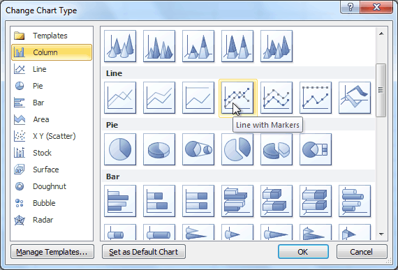
- From the Design tab, click the Change Chart Type command. A dialog box appears.
 The Change Chart Type command
 - Select the desired chart type, then click OK.
 Selecting a chart type
To switch row and column data:
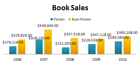
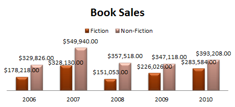
Sometimes when you create a chart, the data may not be grouped the way you want it to be. In the clustered column chart below, the Book Sales statistics are grouped by Fiction/Non-Fiction, with a column for each year. However, you can also switch the row and column data so the chart will group the statistics by year, with columns for Fiction and Non-Fiction. In both cases, the chart contains the same data; it's just organized differently.
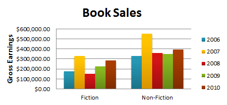 Book Sales, grouped by Fiction/Non-Fiction
- Select the chart.
- From the Design tab, select the Switch Row/Column command.
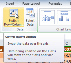 The Switch Row/Column command
 - The chart will then readjust.
 Book sales, grouped by year
To change the chart layout:
- Select the Design tab.
- Click the More drop-down arrow in the Chart Layouts group to see all of the available layouts.
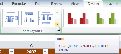 Viewing all of the chart layouts
 - Select the desired layout.
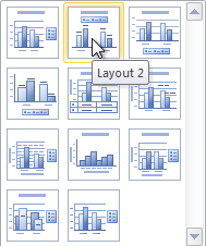 Selecting a chart layout
 - The chart will update to reflect the new layout.
 The updated layout
Some layouts include chart titles, axes, or legend labels. To change them, just place the insertion point in the text and begin typing.
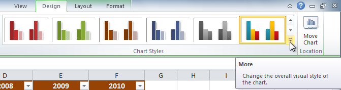
To change the chart style:
- Select the Design tab.
- Click the More drop-down arrow in the Chart Styles group to see all of the available styles.
 Viewing all of the Chart Styles
 - Select the desired style.
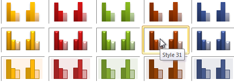 Selecting a chart style
 - The chart will update to reflect the new style.
 The updated chart
To move the chart to a different worksheet:
- Select the Design tab.
- Click the Move Chart command. A dialog box appears. The current location of the chart is selected.
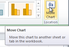 The Move Chart command
 - Select the desired location for the chart (i.e., choose an existing worksheet, or select New Sheet and name it).
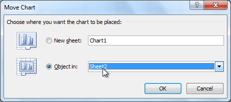 Selecting a different worksheet for the chart
 - Click OK. The chart will appear in the new location.
Challenge!
- Open an existing Excel workbook. If you want, you can use this example.
- Use worksheet data to create a chart.
- Change the chart layout.
- Apply a chart style.
- Move the chart to a different worksheet.