

Excel 2013
Charts
Introduction
Video: Charts
 Watch the video (4:50).
It can often be difficult to interpret Excel workbooks that contain a lot of data. Charts allow you to illustrate your workbook data graphically, which makes it easy to visualize comparisons and trends.
Optional: Download our Lesson 22 Practice Workbook.
Understanding charts
Excel has several different types of charts, allowing you to choose the one that best fits your data. In order to use charts effectively, you'll need to understand how different charts are used.
Click the arrows in the slideshow below to learn more about the types of charts in Excel.

Excel has a variety of chart types, each with its own advantages. Click the arrows to see some of the different types of charts available in Excel.

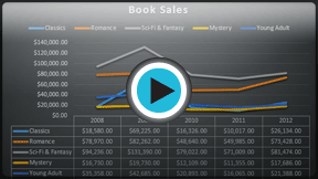
Column charts use vertical bars to represent data. They can work with many different types of data, but they're most frequently used for comparing information.

Line charts are ideal for showing trends. The data points are connected with lines, making it easy to see whether values are increasing or decreasing over time.

Pie charts make it easy to compare proportions. Each value is shown as a slice of the pie, so it's easy to see which values make up the percentage of a whole.

Bar charts work just like Column charts, but they use horizontal bars instead of vertical bars.

Area charts are similar to line charts, except that the areas under the lines are filled in.

Surface charts allow you to display data across a 3D landscape. They work best with large data sets, allowing you to see a variety of information at the same time.

In addition to chart types, you'll need to understand how to read a chart. Charts contain several different elements, or parts, that can help you interpret the data.
Click the buttons in the interactive below to learn about the different parts of a chart.
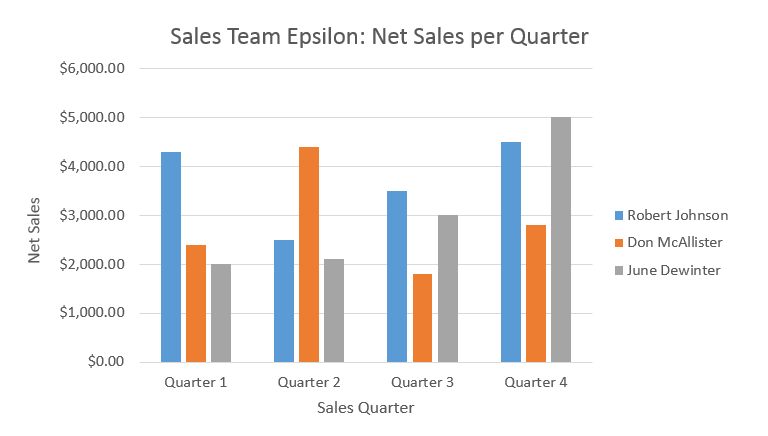
Legend
The legend identifies which data series each color on the chart represents.
In this example, the legend identifies the different salespeople in the chart.
Chart Title
The title should clearly describe what the chart is illustrating.
Vertical Axis
The vertical axis (also known as the y axis) is the vertical part of the chart.
Here, the vertical axis measures the value of the columns, so it is also called the value axis. In this example, the measured value is each salesperson's net sales.
Horizontal Axis
The horizontal axis (also known as the x axis) is the horizontal part of the chart.
Here, the horizontal axis identifies the categories in the chart. In this example, each sales quarter is placed in its own group.
Data Series
The data series consists of the related data points in a chart.
In this example, the blue columns represent the net sales by Robert Johnson. We know his data is blue because of the legend on the right.
Reading the data series, we can see that Robert was the top salesperson in Quarters 1 and 3, while he was the second highest in Quarters 2 and 4.


