CSS Tools & Techniques
Cross-Browser CSS
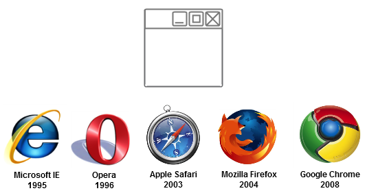
Browsers
- Browsers interpret and present information on the web.
- Each browser varies in how it displays webpages.
- Layout engine: a program browsers run to render markup (HTML) and formatting (CSS).
- Most popular are WebKit (Apple), Blink (Chrome), Gecko (Mozilla)
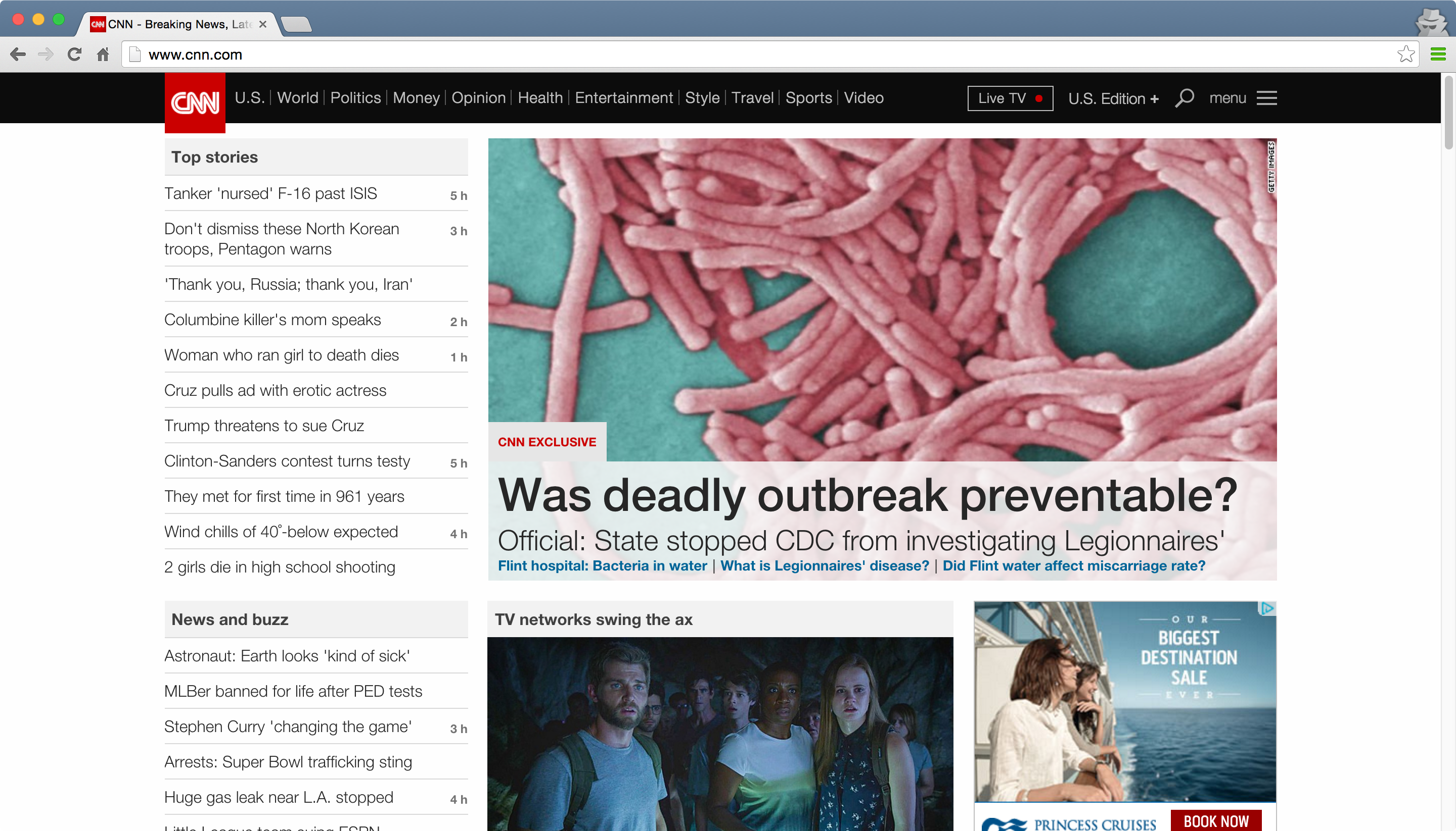
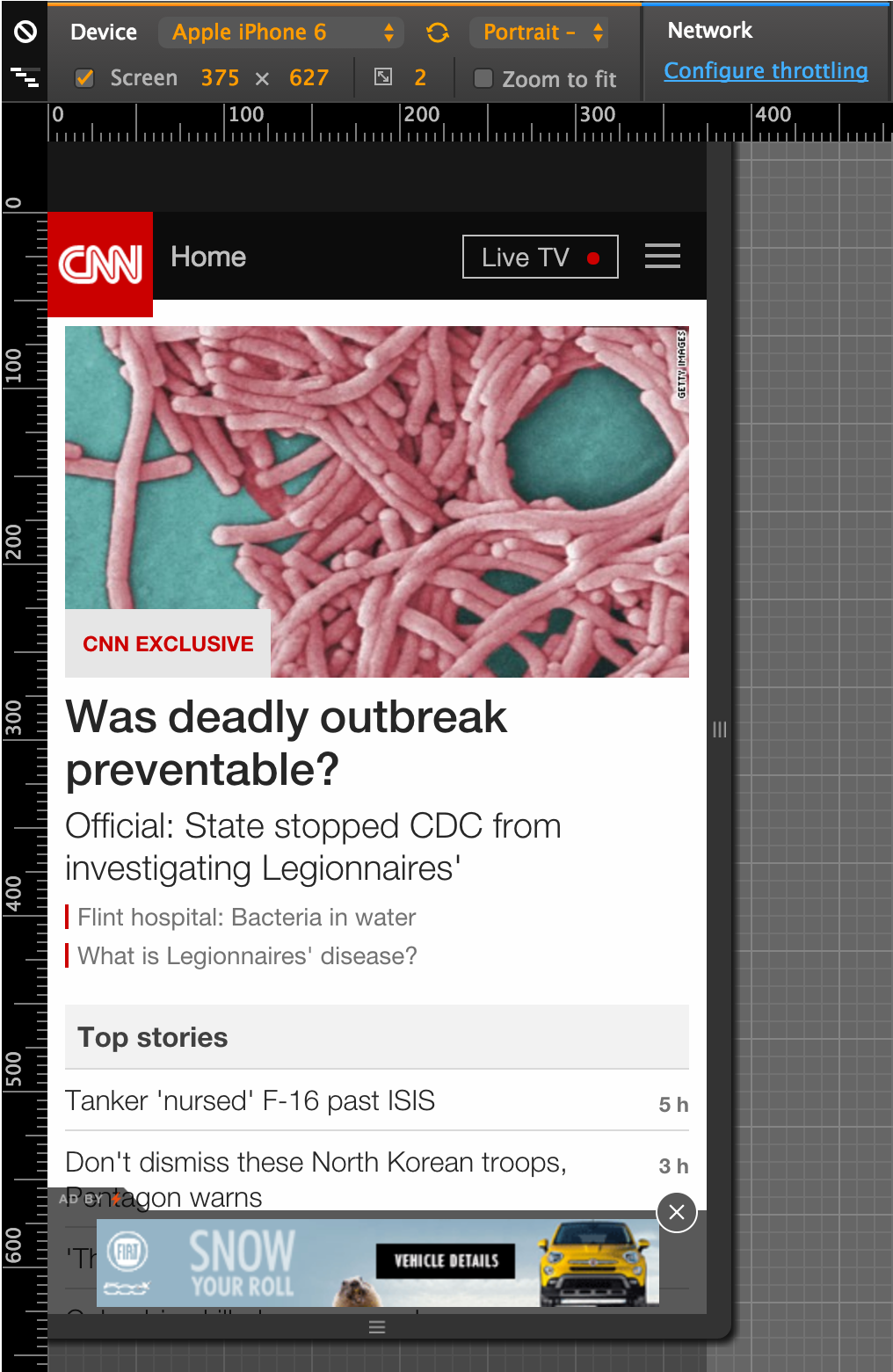
Browsers
Each browser varies in how it displays webpages.
Example: Web browser vs mobile browsers.
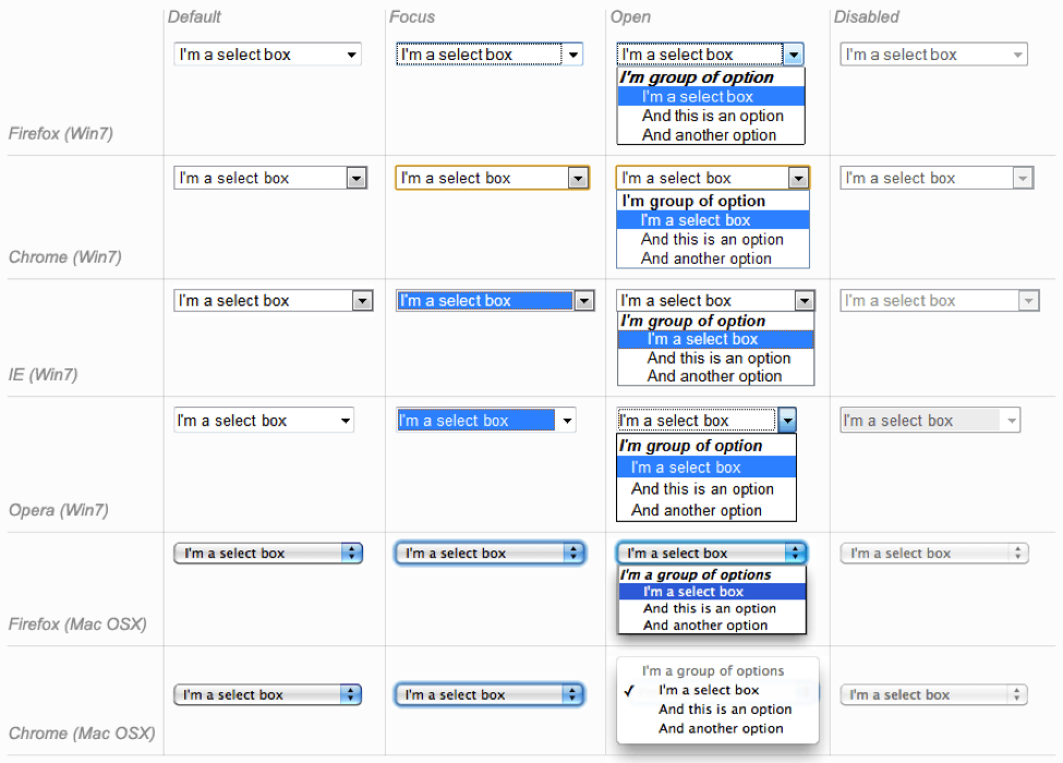
Browsers
Each browser varies in how it displays webpages.
Example: Default form fields.
Browser Compatibility
- The language of the web and standards evolve.
- Older browsers do not know about newer CSS selectors or properties (or newer HTML attributes for that matter!)
- Usually they ignore unknown selectors, sometimes unpredictable.
Use these sites to check compatibility:
Browser Compatibility
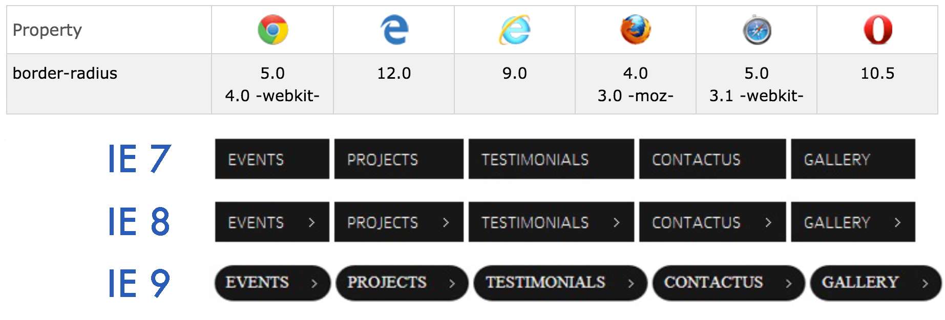
Browser Bugs
- Not all browsers render CSS the same, with the most number of issues in IE.
- The best defense is to be aware and to test.
Browser Testing
Since not all browsers work on all operating systems (IE on Mac), you may need help from these tools for cross-browser testing:
- Modern.ie Microsoft's free access to testing tools
- SauceLabs: Cloud-based automated and manual testing
- BrowserStack: Lets you debug in virtual browsers.
- BrowserShots: Takes screenshots of your sites in different browsers.
- BrowserLing: Ditto.
- MultipleIEs: Makes it possible to test in multiple IE versions on one computer.
- IETester: Ditto.
Cross-Device CSS
CSS Media Queries
A media query consists of a media type and an optional combination of media features. CSS rules inside the query will be applied only if the query is true.
@media <media types> and <media features> {
  /* media-specific rules */
}
They can also be specified for a linked stylesheet:
<link rel="stylesheet" media="<media types> and <media features>"
      href="alternative.css" />
Print Styles
All modern browsers support the "print" media type for specifying print styles.
@media print {
  body {
    background: white;
  }

  #header, #footer {
    display: none;
  }

  .section {
    page-break-inside: avoid;
    page-break-after: always;
  }
}
Resolution Queries
Modern mobile browsers support media queries which depend on the device-width and/or
orientation:
Targeting iPads:
@media only screen and (min-device-width : 768px)
and (max-device-width : 1024px) {
  img {
    width: 100%;
  }
}
Read more: Media Queries for Standard Devices
Resolution Queries
A more general approach is just to query on min-width and max-width,
which are calculated based on window size, not device size.
@media screen and (max-width: 640px) {
  #sidebar {
    display: none;
  }
}
@media (min-width: 768px) and (max-width: 979px) {
  #sidebar {
    width: 200px;
  }
}
Pixel Density Queries
The experimental device-pixel-ratio feature can be used to detect pixel density:
@media only screen and (-webkit-min-device-pixel-ratio: 1.5),
only screen and (-o-min-device-pixel-ratio: 3/2),
only screen and (min--moz-device-pixel-ratio: 1.5),
only screen and (min-device-pixel-ratio: 1.5) {
  #logo {
    background-image:url(images/icon@2x.png);
  }
}
Resolution Testing
Besides testing on the actual devices or resizing the browser, you can use these tools:
Exercise Time!
Good Defaults
CSS Resets
- Not the same blank slate - browsers define different default styles.
- CSS reset stylesheets are used to normalize the default CSS across browsers.
Reset.css removes every default style.
Normalize.css normalizes the default styles across browsers (and is the preferred approach).
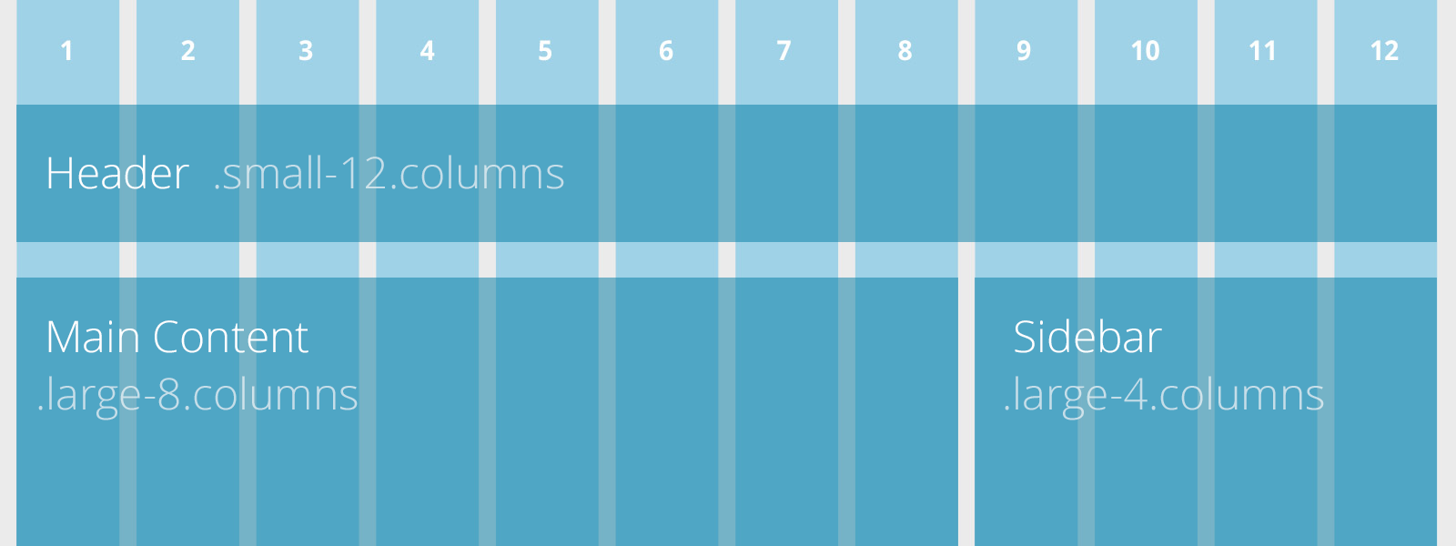
CSS Grids
A grid system lets you layout pages according to fractions of a grid (usually 12, 16, or 24 columns).
Example: Foundation Grid System
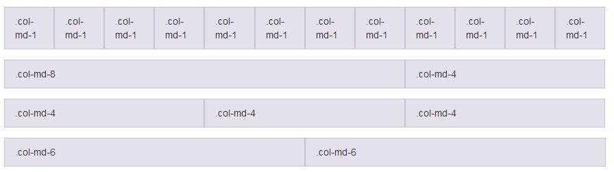
CSS Grids
A grid system lets you layout pages according to fractions of a grid (usually 12, 16, or 24 columns).
Example: Bootstrap Grid System
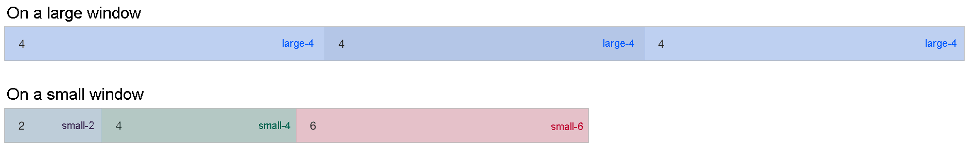
CSS Grids
Example: Foundation grid with mixed classes
Using Foundation CSS Grids:
<link rel="stylesheet" type="text/css"
href="https://cdnjs.cloudflare.com/ajax/libs/foundation-essential/6.0.6/css/foundation.css">

<div class="row">
  <div class="small-2 large-4 columns"> ... </div>
  <div class="small-4 large-4 columns"> ... </div>
  <div class="small-6 large-4 columns"> ... </div>
</div>
CSS Grids
CSS Frameworks
- Why reinvent the wheel?
- Responsiveness and cross browser consistency for free.
- Modular and reusable components.
- Usually include a reset, a grids system, styles for typography and forms. Some include support for mobile/print.
CSS Frameworks
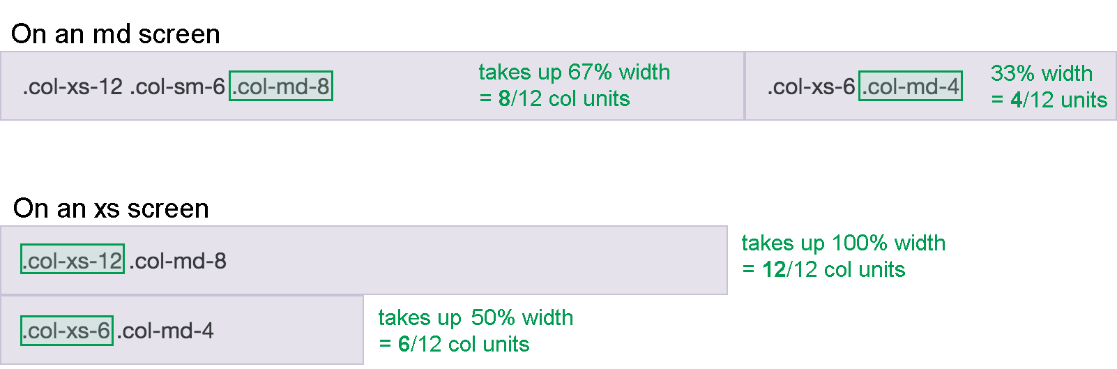
With Twitter Bootstrap:
<link href="https://cdn.rawgit.com/twbs/bootstrap/v4-dev/dist/css/bootstrap.css"
      rel="stylesheet" integrity="sha384-XXXXXXXX"
      crossorigin="anonymous" >

<div class="container-fluid">
  <div class="row">
    <div class="col-xs-12 col-sm-6 col-md-8">First Column</div>
    <div class="col-xs-6 col-md-4">Second Column</div>
  </div>
</div>
Exercise Time!
Extras
CSS workflow in large apps
Improving rendering speed with CSS
- Image sprites (article)
- Data URIs (online converter)
- Icon fonts (Font Awesome)