Measuring Income Inequality
5. Lorenz Curve
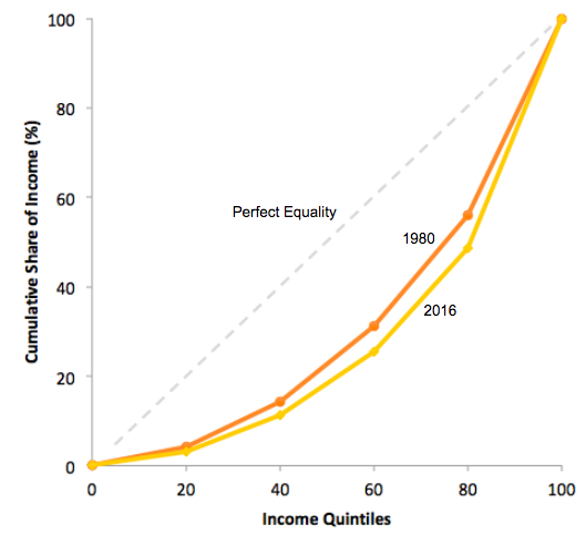
The data on income inequality can be presented in various ways. For example, you could draw a bar graph that showed the share of income going to each fifth of the income distribution. Figure 2 presents an alternative way of showing inequality data in what is called a Lorenz curve. The Lorenz curve shows the cumulative share of population on the horizontal axis and the cumulative percentage of total income received on the vertical axis.

Figure 2. The Lorenz Curve. A Lorenz curve graphs the cumulative shares of income received by everyone up to a certain quintile. The income distribution in 1980 was closer to the perfect equality line than the income distribution in 2016 - that is, the U.S. income distribution became more unequal over time.
Every Lorenz curve diagram begins with a line sloping up at a 45-degree angle. We show it as a dashed line in Figure 2. The points along this line show what perfect equality of the income distribution looks like. It would mean, for example, that the bottom 20% of the income distribution receives 20% of the total income, the bottom 40% gets 40% of total income, and so on. The other lines reflect actual U.S. data on inequality for 1980 and 2016.
The trick in graphing a Lorenz curve is that you must change the shares of income for each specific quintile, which we show in the first column of numbers in Table 2, into cumulative income, which we show in the second column of numbers. For example, the bottom 40% of the cumulative income distribution will be the sum of the first and second quintiles; the bottom 60% of the cumulative income distribution will be the sum of the first, second, and third quintiles, and so on. The final entry in the cumulative income column needs to be 100%, because by definition, 100% of the population receives 100% of the income.
| Table 2. Calculating the Lorenz Curve | ||||
| Income Category | Share of Income in 1980 (%) | Cumulative Share of Income in 1980 (%) | Share of Income in 2016 (%) | Cumulative Share of Income in 2016 (%) |
| First quintile | 4.2 | 4.2 | 3.1 | 3.1 |
| Second quintile | 10.2 | 14.4 | 8.3 | 11.4 |
| Third quintile | 16.8 | 31.2 | 14.2 | 25.6 |
| Fourth quintile | 24.7 | 55.9 | 22.9 | 48.5 |
| Fifth quintile | 44.1 | 100 | 51.5 | 100 |
In a Lorenz curve diagram, a more unequal distribution of income will loop farther down and away from the 45-degree line, while a more equal distribution of income will move the line closer to the 45-degree line. Figure 2 illustrates the greater inequality of the U.S. income distribution between 1980 and 2016 because the Lorenz curve for 2016 is farther from the 45-degree line than for 1980. The Lorenz curve is a useful way of presenting the quintile data that provides an image of all the quintile data at once.