Excel XP
Creating a Chart
Introduction
By the end of this lesson, learners should be able to:
- Identify the parts of a chart
- Identify different types of charts
- Create an Embedded Chart
- Create a Chart Sheet
Understanding the Different Chart Types
Excel XP allows you to create many different kinds of charts.
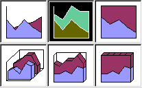
Area Chart
An area chart emphasizes the trend of each value over time. An area chart also shows the relationship of parts to a whole.
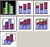
Column Chart
A column chart uses vertical bars or columns to display values over different categories. They are excellent at showing variations in value over time.
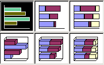
Bar Chart
A bar chart is similar to a column chart except these use horizontal instead of vertical bars. Like the column chart, the bar chart shows variations in value over time.
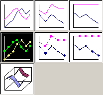
Line Chart
A line chart shows trends and variations in data over time. A line chart displays a series of points that are connected over time.
Pie Chart
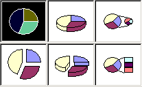
A pie chart displays the contribution of each value to the total. Pie charts are a very effective way to display information when you want to represent different parts of the whole, or the percentages of a total.
Other Charts
Other charts that can be created in Excel XP include: Doughnut; Stock XY (scatter); Bubble; Radar; Surface; or Cone, Cylinder, and Pyramid charts.
Identifying the Parts of a Chart
Have you ever read something you didn't fully understand but when you saw a chart or graph, the concept became clear and understandable? Charts are a visual representation of data in a worksheet. Charts make it easy to see comparisons, patterns, and trends in the data.
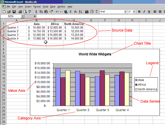
Source Data
The range of cells that make up a chart. The chart is updated automatically whenever the information in these cells change.
Title
The title of the chart.
Legend
The chart key, which identifies each color on the chart represents.
Axis
The vertical and horizontal parts of a chart. The vertical axis is often referred to as the Y axis, and the horizontal axis is referred to as the X axis.
Data Series
The actual charted values, usually rows or columns of the source data.
Value Axis
The axis that represents the values or units of the source data.
Category Axis
The axis identifying each data series.
Creating a Chart Using the Chart Toolbar
Charts can be created in a number of ways in Excel XP. The quickest way to create and edit your charts is to use the Chart Toolbar.
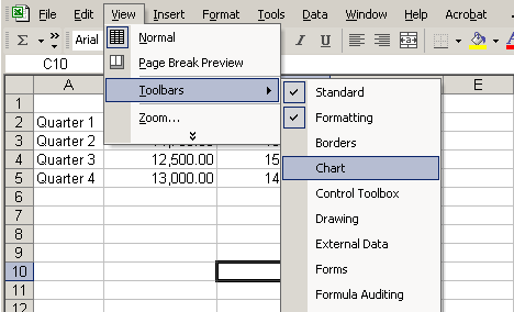
To Show the Chart Toolbar:
- Choose View
 Toolbars
  Chart on the menu bar.
Parts of the Chart Toolbar:
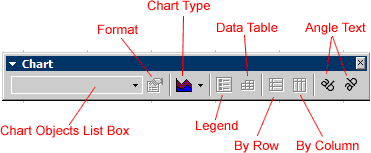
Chart Objects List Box
This list box lets you select different parts of a chart for editing.
Format Chart Area
Used to format that part of the chart which is currently selected.
Chart Type
A drop-down menu that lets you select different types of charts. The chart type can be changed at any time.
Legend
Used to show or hide the chart legend.
Data Table
Used to show or hide the actual Source Data used to create the chart.
By Row
Plots the Data Series using the row labels (Y-axis).
By Column
Plots the Data Series using the column labels (X-axis).
Angle Text
Use to rotate the angle of the X-axis and Y-axis labels.
Creating an Embedded Chart
Charts can be created in either of two ways in Excel XP: Embedded Charts and a Chart Sheet. Excel creates an embedded chart by default. An embedded chart is placed on the same worksheet as the source data used to create it.
To Embed a Chart in a Worksheet:
- Choose View
 Toolbars
  Chart on the menu bar.
 - Select the range of cells that you want to chart. Your source data should include at least three categories or numbers.
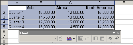
- Click the chart type pull down on the chart toolbar and select the chart that you would like to use.
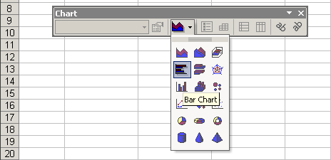
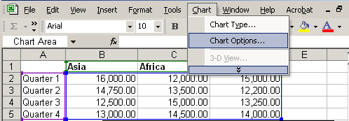
- Open the chart options dialog box: Chart
 Options to add a title to your chart.
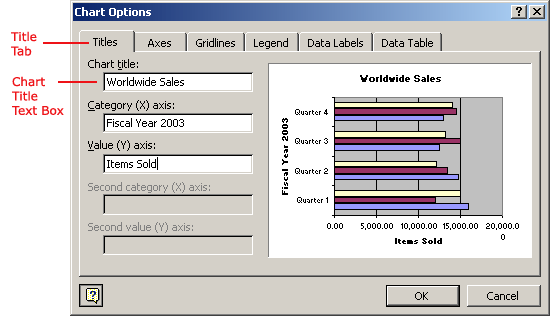
- Select the Titles tab and type the title of the chart in the Chart Title text box.
 Different charts work best with different data. A pie chart, for example, can only display one data series at a time.
 Excel XP includes a 4-step Chart Wizard that you can use to guide you through the steps for creating a chart. Highlight the cell range you want to chart, choose Insert
  Chart on the menu bar and follow the instructions in the wizard.
Creating a chart sheet
Sometimes, you may want to create a chart and place it on a separate sheet in the workbook. This is called a Chart Sheet. Chart sheets can make your charts stand out, particularly when working with complicated spreadsheets.
To Move an Embedded Chart to a Chart Sheet:
- Create an embedded chart.
- Select the chart to be moved to a chart sheet.
- Choose Chart
 Location from the menu bar.
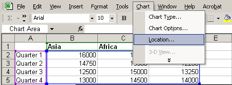
- In the Chart Location dialog box, select the As a new sheet radio button.
(The As object in radio button adds the chart as an embedded object on the worksheet.)
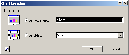
- Click the OK button. The chart is displayed on a separate Chart Sheet in the Workbook.
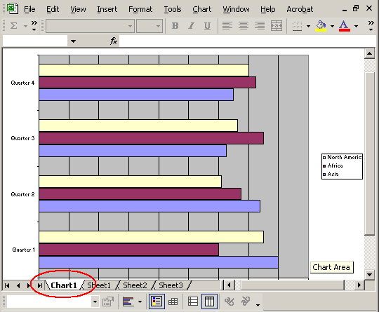
 You can also use the Chart Location dialog box to rename the Chart Sheet.
Challenge
- Type the following information on the worksheet:
In cell A2, type January
In cell A3, type February
In cell A4, type March
In cell B1, type Bill
In cell B2, type 3542
In cell B3, type 7184
In cell B4, type 6531
In cell C1, type Mary
In cell C2, type 2943
In cell C3, type 6542
In cell C4, type 7137
In cell D1, type Bob
In cell D2, type 3403
In cell D3, type 7314
In cell D4, type 6942 - Create an embedded Line Chart showing the numbers on the Y-axis and the months on the X-axis.
- Change the embedded line chart to an Area Chart.
- Convert the embedded Area Chart to a chart sheet.


