Excel 2003
Formatting a Chart
Formatting the chart legend
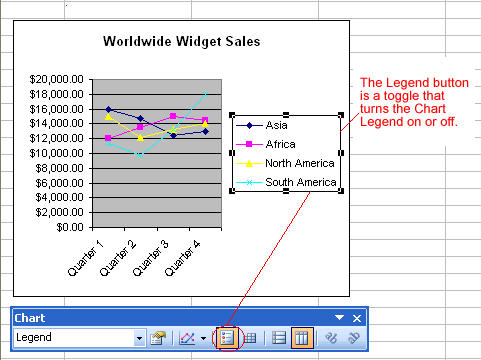
The chart legend displays useful information about the chart. Like a roadmap, the legend identifies what different colors or objects represent in the chart. The chart legend, like the chart title and category axis labels, can be formatted to your liking.
To format the chart legend:
- Press the show/hide legend button on the Chart toolbar to turn on the legend display. (This button acts like a toggle by turning the display on or off.)

- Click to select the chart legend.
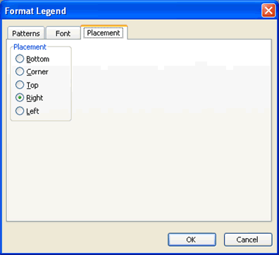
- Click the Format button on the Chart toolbar (or double-click the chart legend).

- The Format Legend dialog box contains three different tabs—Patterns, Font, and Alignment—that can be used to format the chart title.
- The Patterns tab lets you define borders and fill colors.
- The Font tab lets you define font, font style, size, and color.
- The Placement tab lets you define the location where the legend will appear on the chart.

- Click the OK button to accept the chart legend format changes.
 The only way to change the actual text that appears in the chart legend is to change the source data in the worksheet.


