
Loading...

This app is designed and developed by the 2017 NASA Web World Wind Intern Team at NASA Ames Research Center, which consists of John Nguyen, Mingda Tang, Stacey Chen, Atreya Iyer, and Nick Rubel.
Link to our website: AgroSphere
Rights of country agriculture data goes to Food and Agriculture Organization of United Nations: Source
Rights of atmosphere data goes to FluxNet: Source
Rights of country border coordinates goes to Johan Sundström: Source
Rights of country coordinates goes to Google Developers: Source
Rights of background video goes to J Studio: Source
Rights of background audio goes to Kishan Sheth: Source
Rights of flag images goes to GoSquared: Source
NASA World Wind: World Wind
NASA World Wind is a free, open-source API that provides the tools to create interactive visualizations of Earth in 4D. At Ames Research Center, the NASA WorldWind 2017 Intern team has designed an educational web application that visualizes the effects of climate change on agriculture using a large collection of global agriculture and climate data and the Web World Wind Source Development Kit (SDK).
The team utilized technologies including HTML5, CSS, JavaScript, and jQuery to develop the application, incorporating and analyzing spatial data for agriculture and atmosphere. Data in various formats are organized, analyzed and visualized on the globe.
This web app is intended for use in classrooms by teachers and students as well as citizens of the world. Children and adults alike will be able to learn about climate issues by visually experiencing the data according to their interests. Users will learn about the effects of weather over time on agriculture, the impact to national economies, and much more.
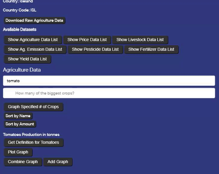
You can plot individual graphs of datasets, and hide them.
Graphs resize automatically when the user interface is resized.
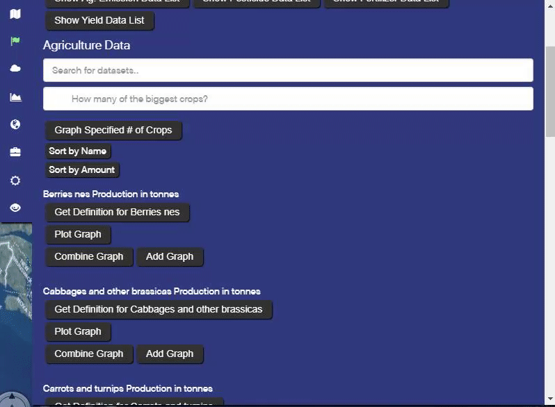
'Add Graph' places this graph below existing graphs in the Data Graphs tab. 'Combine Graph' places this graph's points inside of all existing graphs in the Data Graphs tab.
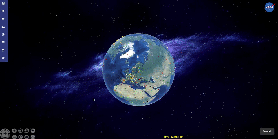
Search for crop Geo-Comparison data and toggle the layers. Use time slider to control the year to be displayed. The legend is based on standard deviations and the z-score. The greener or redder the country color, the higher or lower the crop production is for that country compared to the average of all of the available countries' production.

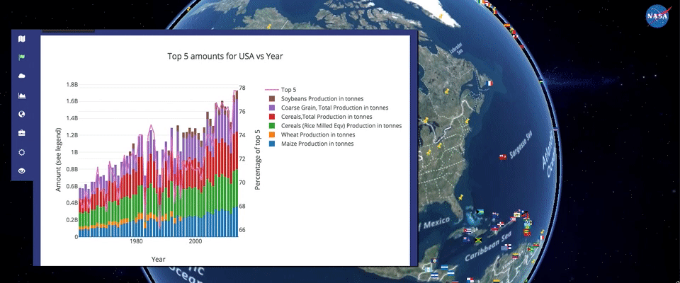
Zoom into a country to view the specified amount of production in tons. Right click and hold to drag and tilt the globe.
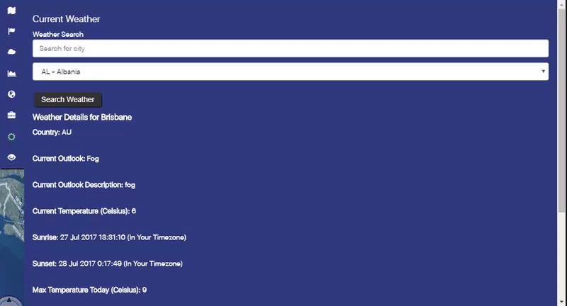
Find current weather of a city, including temperature, pressure, humidity, sunrise, sunset, and etc.
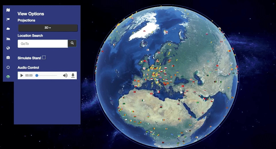
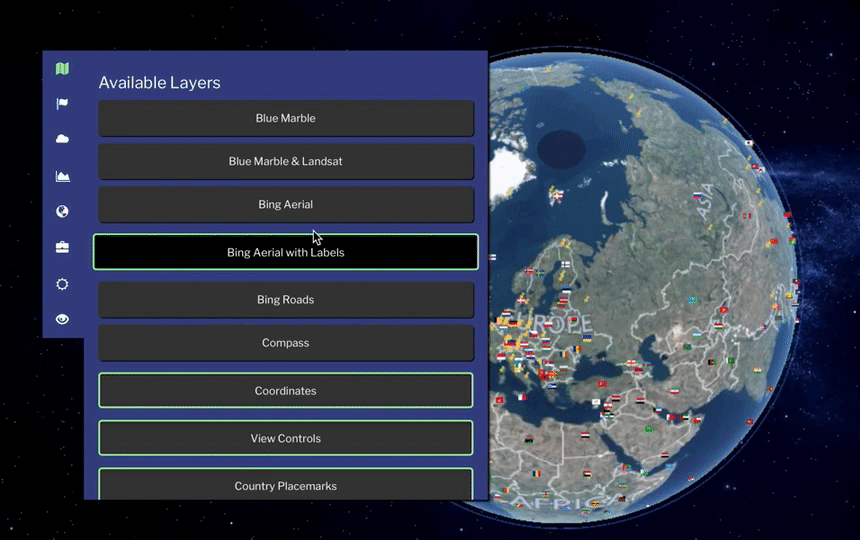
Change projection type and use the search button to specific cities around the globe. Turn on the music with audio control.
The user interface is draggable, scrollable, and resizable vertically, horizontally, and diagonally.
Please click on a flag to see data specific to a country or territory.
Please click on a pin to see data specific to the weather station.
